The body: where it started and where it ended
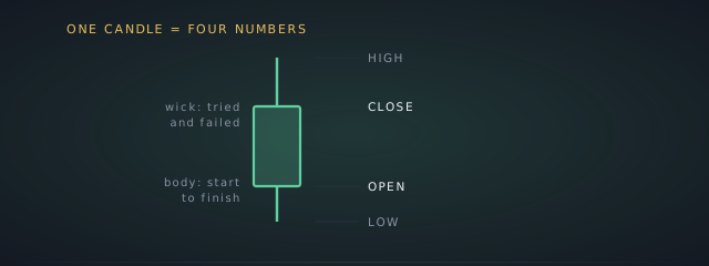
The thick rectangle spans the open and the close. If the close is higher than the open, the candle is usually drawn green or hollow; if lower, red or filled. That colour is the only thing most people look at, and it is the least interesting part. A long body means the price travelled a long way in that period and stayed there. A tiny body means it ended roughly where it began, whatever happened in between.
The wicks: where it went and got rejected
The thin lines above and below are the high and the low. A long upper wick means the price pushed up during the period and came back down: buyers tried, sellers won. A long lower wick means the reverse: it dropped and recovered. Wicks are where the useful information hides, because they record attempts that failed, and the body alone never shows you those.
The timeframe changes everything
The same market can look calm on a daily chart and violent on a one-minute one, because each candle covers a different slice. Twenty red one-minute candles might be one small red daily candle. Before reading anything into a chart, check what one candle represents: this is the single most common way beginners scare or reassure themselves for no reason.
What candles cannot tell you
A shape describes what already happened. Named patterns get treated as predictions, and the honest position is that evidence for their reliability is thin and heavily fought over. Read candles to understand what a period looked like: whether a move was steady or a spike that got sold, whether a level kept getting rejected. That is real. Forecasting is not what they do.
Questions
Frequently asked
What do the colours mean?
Green or hollow means the close was above the open for that period; red or filled means below. It is comparing the period’s start and end, not yesterday, and not your entry price.
What does a long wick mean?
That the price reached a level and did not hold it. A long upper wick means a push higher was sold back down; a long lower wick means a drop was bought back up. Both record a failed attempt.
Which timeframe should I use?
It depends entirely on how long you intend to hold. The mistake is mixing them: taking a one-minute chart’s panic as a reason to abandon something you bought for months.